Castro has been my favorite podcast app for years. Podcast apps generally have the same basic functionality, and Castro didn’t do anything particularly special in that regard; instead, it presented an environment where I wanted to spend time. When I’m using the podcast app, I am, of course, spending most of my time listening to podcasts; and Castro’s screen while playing the podcast puts the podcast episode front and center, coloring the screen based on the podcast art, with the episode notes taking most of the space, and with the chrome arranged around the edges in minimal but functional ways.
It’s not perfect: there’s no share sheet for the liner notes, the scrubber took me a little while to figure out how to use, I couldn’t reliably predict which episodes it would clear out when I needed space, it deletes episodes when you unsubscribe from a podcast, and the badge they added for supporters felt really out-of-place with the visual design of the rest of the app. But I was happy with it for years; I tried out Overcast when it showed up and made a bit of a splash, but ultimately I just preferred spending time in Castro.
So I was glad to see that Supertop brought out a second version of Castro: I like giving money to people who make well-crafted apps (especially an app that I’ve probably spent around a thousand hours with), and I figured they’d probably smoothed out some of the issues that occasionally grated on me. Who knows, maybe they even had something big enough that it needed to be saved for a new version.
And, it turns out, Castro 2 really is focused on something that was missing from the first version, and that I didn’t know how much I liked until I started using it: queue management. Sometimes I’m almost caught up with my podcast backlog, at which point queue management doesn’t matter, but right now that is definitely not the case, and I can use some help reminding me of older episodes that I still actively want to listen to. Also, the original Castro sorts episodes by publication date, which means that, if I follow a link to an old episode of a podcast, then it disappears from sight as soon as I’ve downloaded it.
I’d seen a podcast app before that focused on queue ordering, namely Overcast; but, at least when Overcast launched—I have no idea what it’s like now—Overcast tried be smart about queue management instead of just asking you what you wanted, and it did a bad job of handling a situation when you started playing an episode that wasn’t at the top of the queue. Castro 2 has none of those problems: it lets me fiddle with the queue when I’m in the mood to do so, and when I’m not in the mood to fiddle with the queue, the next episode that I’ll want to play is always going to be in the top screen of the queue, usually right on top. So it really does solve a problem that I didn’t realize I had: I don’t want backlog management to be a nagging issue, I either want to be actively thinking about backlog management or not thinking about it at all. (And it also solves a problem I did know that I had, because it caches the podcasts starting at the top of the queue, going down until it hits the cache size limit, instead of caching an opaque subset of episodes.)
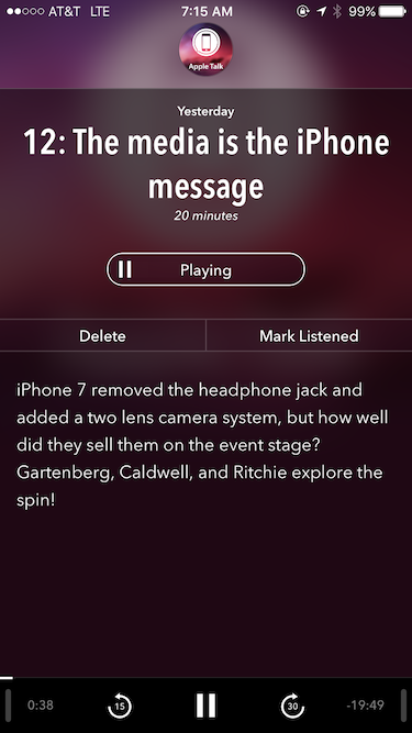
There’s a problem though, and in retrospect that supporters badge was a warning sign: when I’m actually listening to an episode, Castro 2 isn’t a particularly nice place to spend time, and it minimizes the focus on the episode. Here’s what you see when you’re playing an episode in the original Castro:
And here’s what you see when you’re playing an episode in Castro 2:
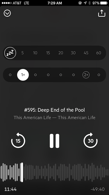
Basically, Castro 2 blows up the bottom quarter-inch of the original screen into an entire screen of its own: instead of minimal chrome, it’s all chrome. It’s a little more functional—in the original, it’s hard to discover how to change speeds, the scrubber is a little hard to use, and I have no idea if the original even has a sleep timer—but none of those differences matter to me. It mostly looks pleasant enough, except for the fake sound representation over the scrubber. (Which gets actively distracting when you skip forwards/backwards, because the sound representation jumps a lot while the scrubber barely moves.) But almost everything about the episode that you’re listening to is missing: no colors, no show notes.
Or at least that’s the “now playing” screen that I first noticed, which you get if you tap on the lower left. If you tap on the lower right instead, you get this:

This is a lot closer to the original version: the chrome at the bottom is only a little over three times as large as in the original (or really more like two times, given the Delete / Mark Listened buttons in the original). Compared to the original, there are a few extra buttons (partly because they’re no longer depending on navigation via sliding), and a few buttons missing; but it’s similar, and of course the show notes are there.
But it’s also a screen that looks like a completely standard podcast episode screen. It’s tastefully designed, but the character is gone.
Because Castro 2’s focus isn’t about bringing the character out of individual episodes: it’s on setting up the stream of episodes. Those two screens aren’t the important one: the important screen is this one:
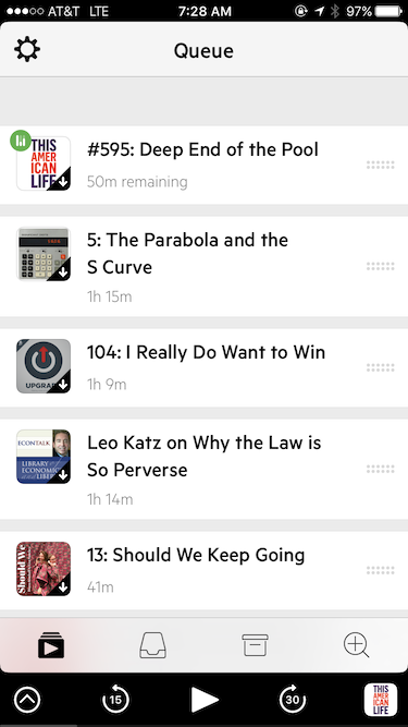
It doesn’t just show you what’s playing and what’s coming up, it makes it as easy as possible to rearrange those episodes. It doesn’t even show you any of the episode notes: that could be useful in evaluating which episode you want to play next, but it would also means that only five episodes fit on screen instead of three, which makes queue management harder. (In the Inbox screen, they do show you the first few lines of the notes, because there are different tradeoffs in that context.) There’s a drag target on the right side of each row, but that’s just there as a visual suggestion that you might want to rearrange the items in the queue: you can, in fact, hold anywhere on the row to drag.
And this queue management really does matter: until using Castro 2, I didn’t realize how much time I spent wondering what to play next, or how frequently I would ignore an episode because it was older, not realizing that it was actually what I was in the mood to listen to next, or at least to listen to once I’d finished the latest episodes of my favorite two or three podcasts. Also, Castro 2 is a lot better at Castro at helping you dig into older episodes of podcasts that you run across, whether individual episodes or podcasts that you’ve decided that you want to go back to the beginning and listen to all of.
So the big difference between the two is that Castro 2 is actively better at queue management, and actively less welcoming when listening to individual episodes. Though, of course, there are other little things that grate at me (just as there were in the original). The biggest is the lack of persistent per-podcast playing speeds: I find it surprisingly annoying to have to change the speed most of the time when a new episode comes up, and this need to fiddle seems to actively work against Castro 2’s presentation of a seamless queue of music for you. I also don’t like it that it takes two taps to go to the show nodes for an episodes other than the topmost episode, and while I do appreciate having a button for the iOS share sheet, I don’t appreciate the fact that those buttons go to links on Castro’s web site instead of the podcast’s web site.
But, ultimately, what frustrates me most is this: I want to interact with things that bring me joy. And a big part of the reason why I’m still a little obsessed with iOS is that iOS app designers have managed to produce apps that bring me joy, that present spaces that I want to inhabit. Tweetie did that, Reeder did that, and Castro did that.
Castro 2 doesn’t do that: the queue management is great, but most of the time, I’m focused on the episode that I’m listening to. And not only does Castro 2 not have the character in that screen as Castro does, it doesn’t even show the same focus on the current piece as Apple Music does.
I’ve gone back to the original Castro. But now it doesn’t bring me as much joy as it did: the queue management in Castro 2 is pointing out something important in myself, too. What I really want is Castro 2 with Castro’s episode screen, and with the small issues above fixed; but I don’t think that’s too likely.
It’s probably time for me to survey other podcast clients again—maybe I’d like Overcast more now, maybe something else good has shown up? Probably not, though, I’ll probably end up back with Castro, just a little less happy with it than I was a month ago…
Post Revisions:
- September 28, 2016 @ 22:00:33 [Current Revision] by David Carlton
- September 28, 2016 @ 22:00:33 by David Carlton
 Posts
Posts