A little over a year ago, I switched from Apple’s Podcasts app on the iPhone to Downcast, and I’m very glad I did: it was much easier to make sure that the podcasts I wanted were available when I wanted them, and to listen to them in the way I wanted. And, given that I spend most of an hour each weekday listening to podcasts during my commute, this is important!

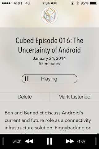
Having said that: Downcast isn’t perfect. It’s a little too clunky, it’s got a few too many options. (My favorite one is “Portrait Lock”: the options are “Disabled”, “Enabled”, and “Enabled (Prevent Upside Down)”. Who wants portrait lock to be enabled but wants the screen to flip when the phone is upside down?) Also, on a practical front: all of those controls mean that there’s not much room for the liner notes (I have a 4S, it’s probably a little better on the larger screen); which is fine but suboptimal most of the time, and actively annoying when listening to foreign language podcasts where I like to read along to what is being spoken.

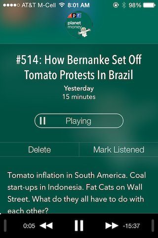
That red rectangle is the liner notes area; it’s just over a third of the height of the screen, only about 50% larger than the controls beneath it.
So I figured there’s room out there for an app I’d like a bit more: one that’s a little more opinionated and focused a bit more on elegance. I saw a few new recommendations towards the end of last year, and Castro looked interesting, so I thought I would give it a try.
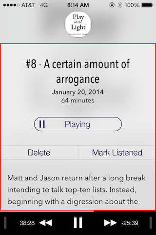
Right from there, you can see one of Castro’s distinctive stylistic choices: the background changes color based on the podcast’s album art, which turns out to be rather lovely. Also, there are a lot fewer controls.
Specifically, here are all the controls that Downcast shows you:
- A Back button.
- Buttons to skip forward and back by small amounts.
- A slider showing your current position in the podcast.
- A button to forward a link to the current podcast to various services.
- A button to loop.
- Buttons to play/pause, and to go to the beginning/end of the current episode.
- A button to control the playback speed.
- A button to set a sleep timer.
- A volume slider.
- An airplay button.
What does Castro do with these? In order:
- The back button is omitted: you have to swipe right to go back.
There are no small amount skip buttons. The small skip buttons are next to the play button, and can also be used to fast-forward/rewind if held down.- The current position slider is there (it’s at the top of the black area at the bottom), but slimmed down and with an interface that took me a little while to be able to operate properly.
- There’s no “forward a link” button.
- There’s no “loop” button.
- The play/pause
and beginning/end buttons are therebutton is there, but there’s no beginning/end button. - There’s no playback speed button (but it’s controllable on the per-podcast settings, or by holding down the play/pause button).
- There’s no sleep timer.
- There’s no volume slider (but of course the standard physical volume buttons work.
- There’s no airplay button (but the standard iOS airplay control is accessible by sliding up).
So, of the ten sets of controls, four three are omitted entirely, four have the functionality accessible in a different way, and two three are present. This leads to a much less cluttered interface, and one that works almost as well. (Incidentally, Downcast has a second hidden play/pause button, accessible by double-tapping anywhere; I quite like that, it’s useful when fumbling.)
And, because of this (and because they shrunk down the height of some of the remaining elements), there’s lots of room: room enough to have a picture of the podcast at the top (which is actually a button that lets you get to per-podcast settings and a list of other episodes), and room for that big text area in the middle. It’s not obvious from the above screenshots, but the entire middle area is scrollable:
giving you almost twice the vertical space for liner notes. Which is great! Except that, ironically, it isn’t: Castro shows you notes from the RSS feed (I think), but doesn’t show you the notes from the lyrics section of the audio file (again, I think). Whatever the difference is, it means that Castro doesn’t show the full notes for Japanese Pod 101 / Chinese Class 101: so, for exactly the podcasts where I want that extra space, I don’t have access to the text I’m looking for! Sigh.
What about the other controls that are missing? Some I don’t care about in the slightest (sleep timer, volume slider). I think it’s a little silly to remove the dedicated back button, but the swipe is easy enough to do. The “forward a link” button I actually occasionally use, but not enough to miss it; personally, I wouldn’t mind if it were there (maybe put it in the upper right and a back button in the upper left, flanking the logo?), but I don’t feel strongly about that.
What I do feel strongly about is the “skip a small amount” buttons. I realize that (many) podcasters want to make money, and while I’d prefer to donate money to them directly, I can certainly understand why most choose ads. So I will always listen to an ad for a company the first time I hear it, probably the first few times; but, honestly, the tenth time I hear the same ad, it’s not helping anybody for me to listen to it. (And the position slider isn’t close to being a replacement for the skip buttons, it’s way too finicky.) Also, there are some podcasters who ramble on about stuff that I don’t care about: I want to subscribe to those podcasts because there’s stuff in them that I find valuable, but I also want an easy way to skip over a tangent that I just don’t care about. So, the result is that Castro wastes my time.
Edit: Whoops, that functionality is there: somehow I got it in my head that the buttons surrounding the play/pause button go to the beginning/end, but in fact they’re small skip buttons (15 seconds back, 30 seconds forward), and if you hold them down then they let you go at high speed through larger chunks. I’m not sure what fumbling I did to make me think that they did something else, but I should have verified that before writing this! (I don’t find the icons super evocative of “small skip”, but they’re also not evocative of “skip to end”, and I don’t have a better suggestion for icons.)
Castro also wastes my time in another way: instead of having three faster-than-real-time speeds and one slower-than-real-time speed, like Downcast does, it has two of each. I find having two slower-than-real-time speeds just odd: I can’t imagine who the target audience is for that one. And there is a significant minority of podcasts that I listen to on Downcast’s fastest speed (labeled as 3x, but actually 2x): again, there are podcasters who don’t edit out their ramblings and hesitations (usually the same podcasters for whom a one hour show is short), and with podcasts like that, my choices are either to listen to them on top speed, to have a single episode take up a third of my weekly podcast listening time, or to stop listening to them entirely. I prefer the first of those choices, which means Downcast.
So: Castro is great for, say, shows like Planet Money with excellent production values and few/no ads; but if I’m listening to Back to Work, I really want the extra flexibility that Downcast gives me. And, actually, I think it would be just as easy for Castro to give me that same flexibility: they have a menu of five playback speeds, they’re just the wrong ones, they can switch that to the right ones. As to the small amount skip buttons: I never use the beginning/end buttons, so if those were replaced by 30-second skip buttons, I’d be completely happy. Edit: Um, yeah. I’m happy!
That’s how the apps behave when playing a single episode: but there’s also managing the episodes, and they’re at least as different there. When you start it up, Downcast shows you a list of all podcasts you’re either subscribed to or have downloaded individual episodes of in the past (by default, you can of course delete podcasts from that list), with the podcasts with unplayed episodes at the top. Castro, in contrast, has a podcast list that shows you all of the podcasts you’re subscribed to, with no sorting based on unplayed episodes, which I don’t find very useful at all: for me, most of those podcasts will be empty if I click on them.
But Castro also has an “Episodes” tab; that one shows you the unplayed episodes from the different podcasts, mixed together. (Which you can get with Downcast as well: they have a flexible playlist feature.) I started using that; and, once I got over the change, I decided that it works rather well, that in fact I prefer it. (At least for most podcasts—there are some podcasts where I have a lot of back episodes stored up that I want to keep around, and I’m just leaving those in Downcast for now.)
That’s for podcasts that you’re subscribed to; Downcast also has a notion of a podcast that shows in your list but that you’re not subscribed to, whereas Castro apparently has no such notion. Which I was annoyed by at first: I subscribe to 20 podcasts, but there are maybe 30 or so more that I’ll listen to occasional episodes of if I have reason to find them interesting. And I don’t want to subscribe to all of those, because that means it will take time fetching feeds and I’ll have to be constantly manually clearing out episodes I don’t want to listen to. (Incidentally, I have no idea when Castro refreshes feeds; that bothered me for a while, but it seems to work well, so it doesn’t bother me so much now. Still, pull-to-refresh would be welcome…)
Fortunately, it turns out that Castro has a workaround to that: you can go to the “add podcasts” screen and type in a podcast name, and then download individual episodes from there. If you do that, you’ll get the episode(s) in the Episodes tab but you won’t get the podcast in the Podcasts list. Which is a fine tradeoff compared to Downcast: slightly harder access to those podcasts at the balance of less clutter, and that’s fine. In fact, it ends up being the only reason why I ever go to the Podcasts tab: given that, I would stick the “Add podcast” button at the bottom instead of the top, and I’d have the app default to putting you on the Episodes tab instead of the Podcasts tab.
So, where does this leave me? I like the aesthetics of Castro a lot more; it’s now my default podcast app because of that. But if I had to choose one, I would still stick with Downcast: for a significant minority of podcasts, Castro’s behavior is a deal-breaker. If Castro would make three changes, though, then I would use it 95% of the time: specifically, I would like it to:
Give me 30-second skip buttons (preferably in place of the whole-episode skip buttons),- Give me a 2x listening speed, and
- Display the full notes for Japanese Pod 101.
If it made those changes, I’d recommend it whole-heartedly.
Or, for that matter, if Downcast would change its aesthetics somewhat, I’d probably be happy to recommend it whole-heartedly as well! That’s a harder one for me to talk about, though: it does have a strong aesthetic, it’s just that that aesthetic is about configurability. So they’ll probably do better staying focused on that then on trying to be something else; and I’ll probably still continue to use Downcast for a minority of situations where those choices matter to me.
Post Revisions:
- February 5, 2014 @ 18:29:33 [Current Revision] by David Carlton
- February 5, 2014 @ 18:29:33 by David Carlton
- February 4, 2014 @ 18:20:18 by David Carlton
 Posts
Posts