I Love Hue starts off as this super chill game about colors. You get presented with a rectangle full of colored squares; some of them are fixed in place, and you want to move the rest around so the whole thing makes a smooth color gradient. And it’s all very pleasant: more or less obvious what to do, though sometimes it takes a couple of guesses as to which shade of green goes in a specific place, a nice way to spend some time.
As the levels progress, it gets harder. There are fewer fixed squares; eventually the norm becomes for only the four corner squares to be fixed, with you having to interpolate the rest. Which is fine, that’s actually not inherently particularl hard, it just makes things a little more interesting.
What does start to get hard, though, are where the color palette shrinks. At the start, you’ll maybe have blue in one corner and yellow in another corner and purple in another; so the differences are clear. But then it starts getting quite a bit more subtle: maybe the whole board is in a blue to yellow to green range, with no reds showing up at all, for example.
And, at this point in the game, I realized that I actually don’t understand how color perception works. Like, the tiles that belong on the edge always felt brighter somehow than the tiles that are in the middle; I assume that’s a perceptual artifact rather than anything about the specific colors that the game chooses, but who knows? Also, my notion of color is very naive, modeled on a circle of red/orange/yellow/green/blue/purple combined with a lighter/darker continuum, but that’s only two dimensions, whereas color is actually more of a three-dimensional thing? (Looking up terms, I think “saturation” is the concept that I’m missing.)
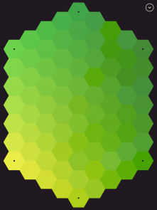
And, eventually, the game morphs into a whole different sort of thing. Take this picture, for example:
This is no longer a chill game about rearranging squares, or even rearranging hexagons. (They add in triangles later on, which turns out to be extra challenging.) I think the left half is correct, but there’s one place I’m not sure of? And pretty clearly there’s something wrong in the upper right.
But there’s something more subtle wrong in other places. If you look at the middle column, for example: the one that’s the third from the bottom seems too dark compared to the one that’s second from the bottom. But it wasn’t at all clear to me what to do about that: when I tried to swap in other nearby colors, that bit seemed better but other bits seemed worse.
For that particular level, I gave up and restarted, and somehow it worked out better the second time. And I didn’t hit that sort of roadblock in all of those later levels.
But I did hit roadblocks in a bunch of them; sometimes situations like the above, where the whole level was across a narrow color spectrum, sometimes situations where the set of fixed tiles was chosen in a way that made it particularly hard to interpolate between them. (Or extrapolate from them, if they were on the middle instead of the edges.)
And it was an experience that I’m not used to. Interesting to grapple with color perception; interesting from a gameplay perspective, too, to uncover some non-atomic conceptual moves. (For example, if you hit a hard-to-analyze discontinuity like the one above, then a certain kind of oblique shift of a whole row of tiles ends up helping.)
Great game. Not the sort of game you’ll sit down with for hours, probably; but I enjoyed doing a puzzle or two most days for months. (Probably for about a year, actually.)
And now there’s a sequel out, playing around with shapes; I haven’t yet hit the part in that game where it starts to mess with me, and I don’t even know if the sequel goes as far, but it’s pleasant to be back to a chill game about sliding colored tiles around, too!
Post Revisions:
- March 22, 2020 @ 20:45:00 [Current Revision] by David Carlton
- March 22, 2020 @ 20:45:00 by David Carlton

 Posts
Posts